
For a circle of dandyish readers in the late Victorian era known as the Mauve Nineties, The Yellow Book offered something genuinely new—illustrated covers as a focal point of a book’s identity. When the literary quarterly debuted its inaugural volume in spring 1894, it did so with a cover bound in rich cloth of a midnight-hued yellow, as if lit by a flickering gas lamp, and featuring a stark black caricature of a seventeenth-century coiffed and beauty-marked woman in a carnival mask, laughing while a second androgynous figure stands behind her. “If I am not grotesque,” declared the designer Aubrey Beardsley, “I am nothing.”
Drawing inspiration from Parisian poster artists, most notably Henri de Toulouse-Lautrec, Beardsley—whose face, according to his friend Oscar Wilde, looked “like a hatchet”—often appeared at publishers’ offices in a rumpled morning coat and yellow gloves. He imagined the everyday, utilitarian book cover as a vehicle for beauty rather than a mere wrapper.
Reading a book begins before a book is ever read, and of course the cover images are the most integral part of that process.”
Before Beardsley, the cover was the binder’s concern; after him, it became the province of artists. In the Middle Ages, vellum bindings were protected by intricately carved wooden boards with clasps to fend off humidity; in the age of print, books could be bound in leather or stiff cardboard, sometimes with a frontispiece woodcut. Yet The Yellow Book—named after the hue associated with illicit French novels—elevated the modest cover to a new standard of aesthetic importance. In this case, perhaps more consequential than the literature itself, because although the quarterly did publish pieces by Henry James and W.B. Yeats, it is the covers Beardsley created for its first four issues that endure in memory (he was dismissed and eventually died of tuberculosis). The first edition’s price was five shillings, and a typographical error even misprinted the month as “Aprtl.”
“Advertisement is an absolute necessity of modern life,” Beardsley wrote in a 1894 essay for The New Review. While a cover’s obvious purpose is to promote the work, it also hovers mysteriously over what the reading experience might feel like. Perhaps that’s part of what keeps me from embracing digital books. The tangible sensation of a book—the smooth gloss of a dust jacket on a hardback, or the soft matte of a paperback, the texture of deckle-edged paper, the sheen of velvet lamination that catches fingerprints—shapes what reading is, and defying New Critical dogma, to read the words on the page while ignoring the page itself can feel as if one hasn’t read at all. Reading a book begins before a book is ever read, and of course the cover images are the most integral part of that process.
Among the volumes I’m currently exploring on my metaphorical nightstand are Jerry Saltz’s Art Is Life: Icons and Iconoclasts, Visionaries and Vigilantes, and Flashes of Hope in the Night, John Ganz’s When the Clock Broke: Con Men, Conspiracists, and How America Cracked Up in the Early 1990s, and Emily Eakin’s The Frenchman: Or, My Life in Theory. The covers on these works were crafted by graphic designer Ben Denzer, freelance artist Patrice Sheridan (after an illustration by Thomas Colligan), and Penguin Associate Art Director Amanda Dewey, respectively.
Denzer’s design arranges the title and author’s name in warm gradients of red, pink, and purple atop simple geometric blocks, evoking the abstraction of a Magritte or a Rothko canvas; Sheridan’s cover echoes a time just before Ganz’s narrative—an image of a minimalist red-and-blue clock with stars replacing numerals that spills beyond the clock’s face, with the title rendered in hues borrowed from the American flag; Dewey’s playful yet subversive cover presents a woman in a Parisian-black turtleneck, a Gauloises held between two fingers, but with the contour of her head erased, as though a collage artist had excised it from a magazine and placed it beneath the pink letters of the title, deliberately channeling the chic aesthetic of chick-lit while anchoring a nearly 500-page text on Derrida, Foucault, and Lacan. Each one, in its own lineage, echoes Beardsley’s legacy yet points toward a contemporary sensibility.
“I resolved to do no less than transform the world with Beauty,” wrote William Morris, a central figure in the British Arts and Crafts Movement that so influenced Beardsley. As that movement evolved into Art Nouveau—with its elongated florals, sinuous forms, and polished surfaces—Beardsley grasped the cover as a conduit for beauty as much as commerce. Although the Arts and Crafts movement possessed a democratic ethos—Wilde himself, linked to many adherents, leaned toward a socialist sympathies—figures like Morris and Beardsley promoted a liberation of the pleasing, a shared accessibility to aesthetics. They argued that everyday things—utensils, furniture, and even books—could be designed to balance practicality with beauty, rather than existing on opposite poles.
Not only is the adage “never judge a book by its cover” a cliché, it also neglects the fact that so much of literature exists beyond the page itself. To ignore the cover is to pretend that a work’s meaning can be separated from its material form. “More than a boundary or a sealed border,” writes Gerard Genette in Paratexts: Thresholds of Interpretation, the so-called paratexts of a book—dedications, prefaces, epigraphs, tables of contents, and, of course, the cover—are integral to how a reader encounters a text. Genette’s theory insists that a proper reading cannot exclude these surrounding elements, for they shape the work as a whole.
A history of literature could be written by analyzing book cover trends.
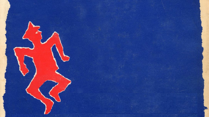
Some covers become so iconic that, even decades later, they remain inseparable from how a work is understood. Consider the golden era of jacket art: Shirley Smith’s emblematic design for Harper Lee’s To Kill a Mockingbird (1960)—a green, leafy tree framed by a crimson backdrop; Paul Bacon’s leaping red figure beneath blue spaces in Joseph Heller’s Catch-22 (1961); S. Neil Fujita’s instantly recognizable image for Mario Puzo’s The Godfather (1966), with a puppet-master’s hand gripping a control lever that eerily resembles a cross. Smith’s tree hints at America’s racial tensions, particularly in the South where the novel unfolds; Fujita’s abstract hand signals the Machiavellian meddling in the Corleone saga. These visual cues are not incidental to the text; they actively modulate its meaning.
Covers can reflect or reinforce ideological commitments, whether through the social realism of Elmer Hader’s 1939 cover for John Steinbeck’s The Grapes of Wrath—the Joad family barefoot and dressed in soiled overalls, surveying a blasted landscape—or through the 25th-anniversary edition of Ayn Rand’s Atlas Shrugged (1982) by Nick Gaetano, which presents a gleaming, robotic titan against a gold field. In Orwell’s Nineteen Eighty-Four, the question of “how” Big Brother watches shifts with the edition: the early, simple typography on a green field, the 1950 Signet version’s pulp aesthetics that undercut some of the dystopia’s grave undertones, or the 75th-anniversary Mariner edition with a ubiquitous, all-seeing eye. A 2013 Penguin Classics edition even chose to obscure the title and author with stark black lines, a choice that some will find terrifying while others find elegantly minimal—future versions might do well to show a Flock camera instead.
A history of literature could be written by analyzing book cover trends. There have been cycles of fashion: the libertine Belle Époque, influenced by Beardsley’s example, with designers such as Hugh Thompson, Margaret Armstrong, and Sarah Wyman Whitman weaving delicate borders of florals and peacock feathers; the radical avant-garde of the Russian Constructivists who fused geometric shapes with photomontage by creatives like Alexander Rodchenko and Varvara Stepanova; and the lurid, postwar pulp era in America where McGinnis or Norman Saunders specialized in pin-up queens, hardboiled detectives, and otherworldly craft.
In recent years, multiple currents have risen and fallen, even as the craft endures in a world increasingly shaped by artificial intelligence. The current vogue fuses classical painting with a hint of punk typography, as seen in Darren Haggar’s design for Ottessa Moshfegh’s My Year of Rest and Relaxation (2018); the clean midcentury elegance of Lynn Buckley’s work for Meg Wolitzer’s The Interestings (2013) and Geraldine Brooks’s Horse (2022); and the bold, pop-art postmodern collages of Rachel Wiley for Anna North’s Outlawed (2021)—where a face is mostly erased, save for a splash of red lips. These contemporary images carry the lineage of Beardsley forward, even as they reinterpret it for modern readers.
In an era dominated by digital reproduction, physical covers still carry weight; the Zen-like blue-and-white jackets from Fitzcarraldo Editions have supplanted the old Penguin Classics for many readers who crave a certain elegance, while the NYRB Classics line maintains a modernist uniformity that speaks to a shared standard of taste. Through all of this, the designer remains at the center. Chip Kidd may not share the fame of Crichton or McCarthy, yet his jackets for Jurassic Park and The Road have become instantly recognizable icons; Junot Díaz’s The Brief Wurtless Life of Oscar Wao earned the 2008 Pulitzer Prize, but Rodrigo Corral’s ethereal cover was the image seen by many before they opened a page. Cover design reminds us that literature is not the sole province of the author; it is a deeply collaborative enterprise. If we borrow the sentiment from Shelley, perhaps designers are the unsung poets of the world.
Personally, I have been fortunate with covers, where the visual identity of a book feels inseparable from its words and from the moment I first hold a dedicated author copy. David Wilson’s abstract treatment for my 2021 An Alternative History of Pittsburgh—a black-and-gold composition that evokes kintsugi’s gold seams healing broken pottery—remains a strong influence on why I still sign new copies of that book today. Beste M. Doğan’s design for my 2024 Devil’s Contract: The History of the Faustian Bargain, featuring a Gothic-type arrangement around a color collage and a Renaissance woodcut, made me recall my favorite horror covers from the 1970s and made my pulse quicken when my editor first sent the JPEG. Writers can be possessive; yet it would be disingenuous to pretend our books exist without the visual collaborators who shape them.
After all, would F. Scott Fitzgerald’s The Great Gatsby be felt in the same way without Francis Cugat’s cover, a century-old image of Daisy Buchanan’s otherworldly face rising from the lights of a seaside amusement park, her earring sparkling like a sparkler? Can one imagine J.D. Salinger’s The Catcher in the Rye divorced from E. Michael Mitchell’s 1951 cover—the refined, red horse on a Central Park carousel and the faint outlines of prewar Upper West Side apartments drawn below? And what about Hugh Thomson’s 1894 illustration for Jane Austen’s Pride and Prejudice, with a peacock perched atop an urn, its every feather brushing the blue border of the novel, a vision so beautiful that it still graces the book’s cover 132 years later?